NEW WORLD STAGES
- 1 Jan 2017
- Featured Project
- Objective : New World Stages was in desparate need of a new website.
- Visit Actual Website »
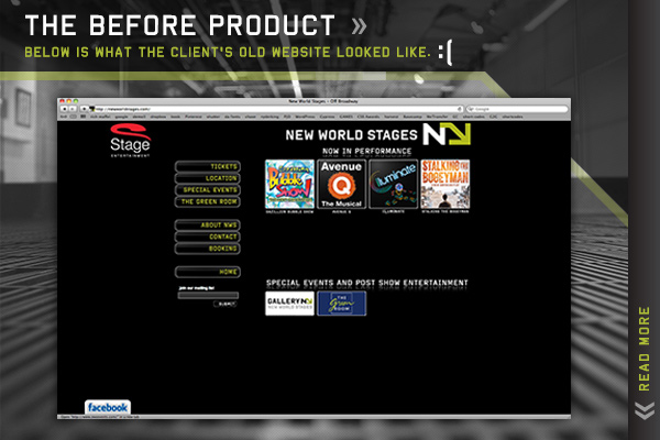
As you can clearly see in this screen shot above, the client’s website was severely dated looking and just a poorly executed design and user interface/experience that did not do any justice in representing their organization or brand as a whole.
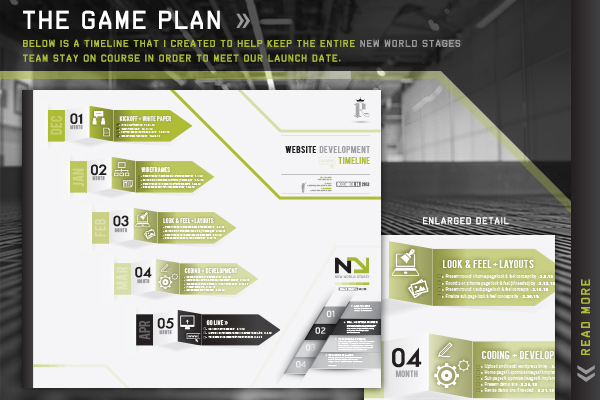
A timeline is the first tool that I recommend all designers + developers present to their clients. It is a must-have asset if you are up against any sort of deliverable or deadline.
[ view full size timeline » ]
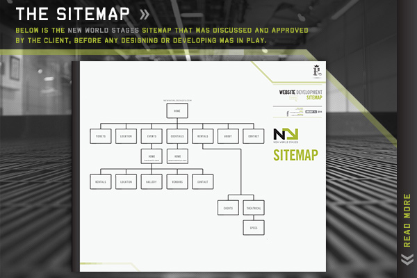
A sitemap is an essential must-have element that needs to be discussed and approved by the client before any initial creative layouts or wireframes are addressed. This project was actually three total websites in one with a main parent site and two additional daughter sites that all needed to connect and flow together as one seemless entity. Therefore journey boards and the perspective and awareness of a Users Experience (UX) was required and needed to be ironed out at this stage.
[ view full size sitemap » ]
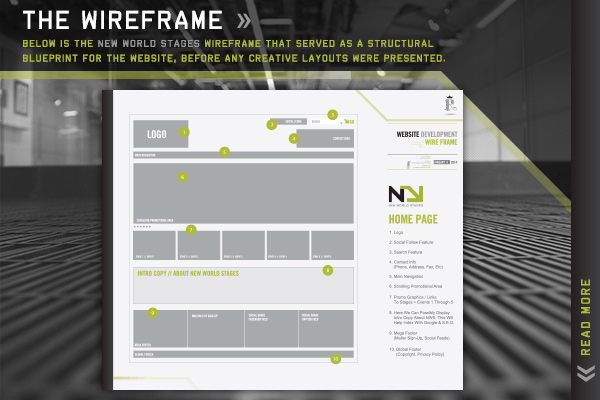
Wireframes were created and approved by the client before any creative layouts were addressed or presented. These help save a lot of time and rounds prior to the creative layout phase, being that all structural elements were established in regards to placement on the page and where items would make the most sense. Think of the purpose of a wireframes sort of like how a blueprint would serve as the guide prior to constructing your new home or building.
[ view full size wireframe » ]
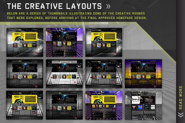
After a series of four creative rounds, we explored several different design concepts before arriving at our final approved layout. The creative layout phase saves a ton of time in the overall design and development process due to the fact it is a whole lot faster and less dawnting of a task to move pixels around in apps such as Photoshop or Sketch, as oppose to moving around and rearranging lines and lines of structured code. Coding should always be the final phase.
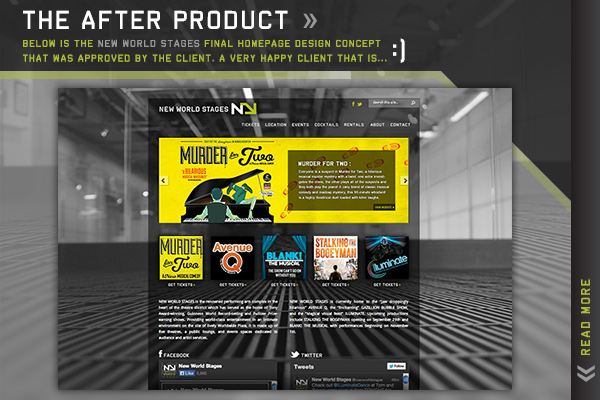
Above is a screen shot of the final client-approved homepage design concept after the site was coded and published live for the word to see. Always by far the most rewarding and satisfying phase for obvious reasons… The icing on the cake if you will.
[ launch live website » ]
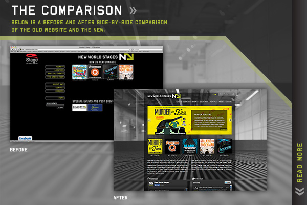
Seeing the old website side-by-side next to our newly designed and revamped site really sums it all up. I hope this page helped you understand my go-to process, and narrates how I approach a web project from concept to completion.
[ launch live website » ]
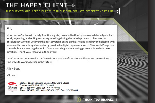
Michael Coco, Managing Director of New World Stages, expresses his thoughts on launch day.
THANK YOU MICHAEL!